
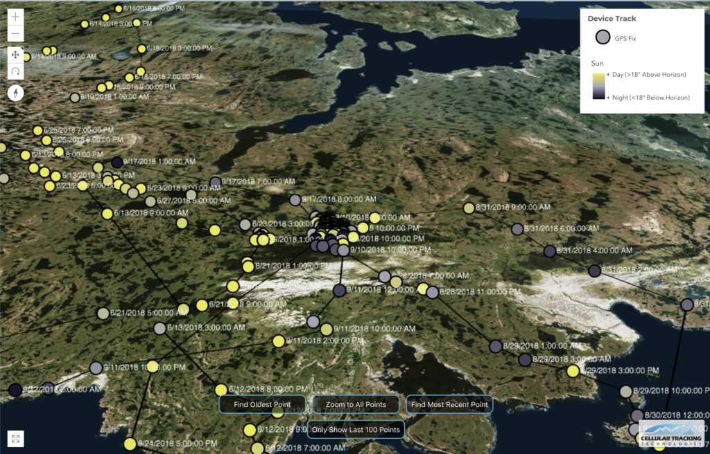
Stella’s movements this past summer in the Arctic, as shown in the new map style that Project SNOWstorm and CTT are rolling out. (©Project SNOWstorm/CTT/Esri)
From the beginning, one of the most exciting aspects of Project SNOWstorm has been our interactive maps, which allow everyone — not just those of us with access to the raw tracking data — to follow every move that our tagged owls make.
Those Tracker Maps were the brainchild of Don Crockett from Connecticut, who contacted us shortly after we launched SNOWstorm offering his proprietary software and his enthusiastic help, then worked with us over the years to add features and functions, like red/blue coloration to the tracks to denote day/night movements.
Unfortunately, with Don’s untimely death last year it has proven increasingly difficult to update existing maps with new data, or to create maps for newly tagged owls. So since last season, our colleagues at Cellular Tracking Technologies (who also make our transmitters) have been working on a fresh approach to our tracking maps — and we think they’ve hit a home run.
The new maps allow 3D rendering of the whole globe on your browser, and give you far more ways to view and manipulate the tracking data than before, while not overloading your computer and slowing the process.
For instance, the maps feature something called dynamic point selection. The path for a bird like Stella, whom we tracked north to the Arctic and back south again this autumn, contains thousands of GPS points; getting them all at once can be overwhelming and visually confusing. When you first open the new map, you’ll see an overview of Stella’s entire track — but a limited number of GPS locations along the way. (Each round icon will be yellow for daytime, or gray for twilight and black for night.)
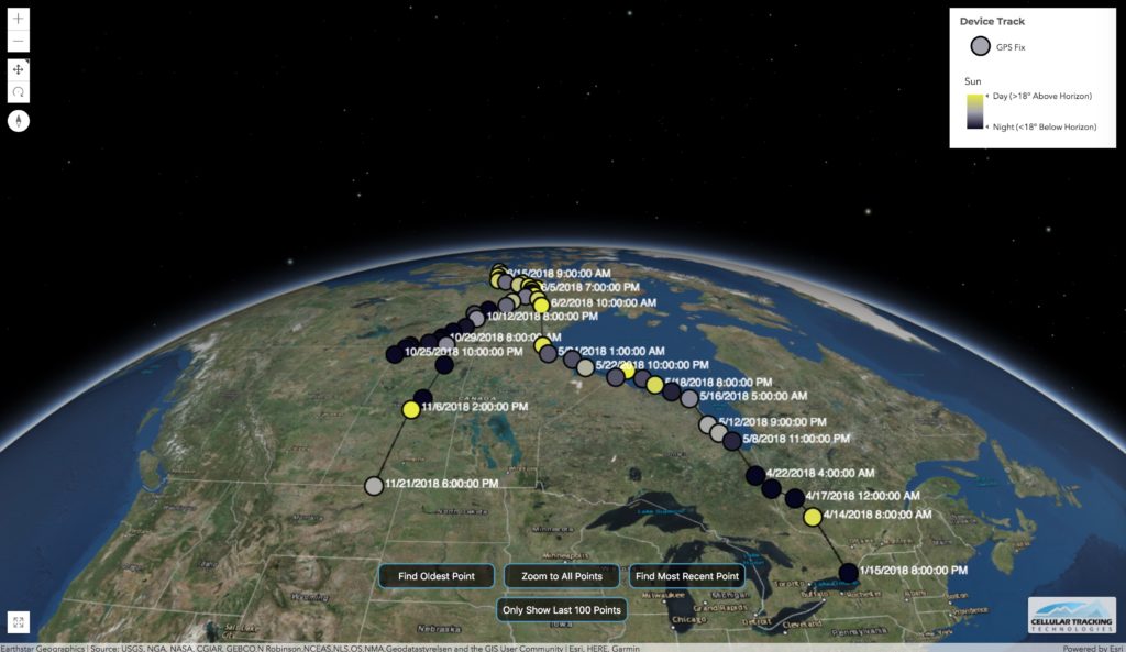
When you open one of the new maps, you’ll initially see an overview of the owl’s entire track to date. (©Project SNOWstorm/CTT/Esri)
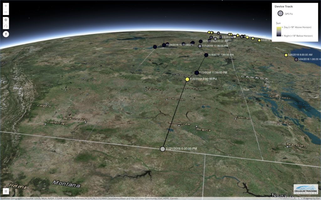
Dynamic point selection means that when you look at very large areas, only a representative sample of points are shown…
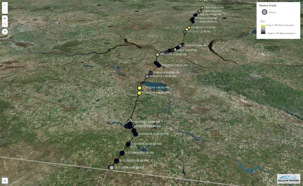
…but as you zoom in, more and more points appear. (©Project SNOWstorm/CTT/Esri)
Where’s the detail you’ve come to expect? Just zoom in — the closer you get, the more and more locations will appear. The date and time are included for each, making it much easier to trace the chronology of the owl’s movements. Zoom in far enough, and you’ll see small blue icons, triangles that show direction of movement. Click on any of the GPS icons, at any zoom level, and you’ll get a wealth of information about what the owl was doing at that moment — date, time, coordinates, and its heading, altitude and speed if it was in flight.
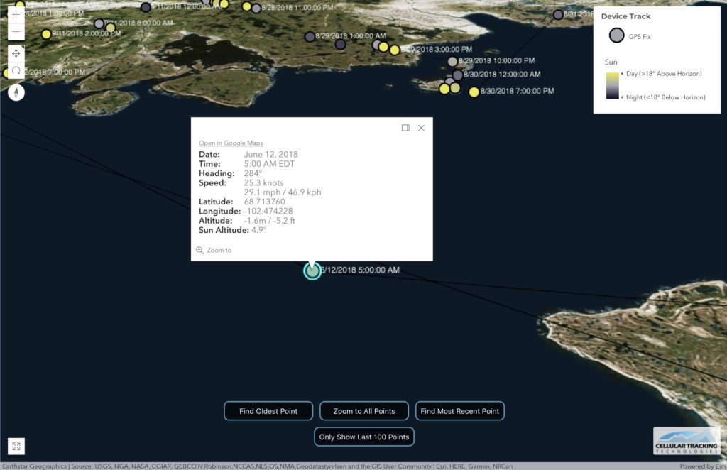
Click on any icon, and you’ll see exactly what the owl was doing at that moment — as here, when Stella was flying at 29 mph/46.9 kph across Queen Maud Gulf . (©Project SNOWstorm/CTT/Esri)
You can click on two icons in the upper left to toggle between panning or rotating viewing angles in 3D.

Click at the red arrows to toggle between panning (flat) and rotating (tilted) navigation in 3D.
In the past, creating and updating the maps entailed a lot of manual, keyboard work. The new maps will be updated automatically as new data come in. As always, our main concern is for the well-being of the tagged owls, so there will be at least 24-hour delay in automated map updates, to give the owls some breathing room from overly enthusiastic fans.
At the moment, the only map in the new style is Woodworth, our first tagged owl of this season. But the others will be changing over in the days ahead. We’re incredibly grateful to Russell Conard at CTT for all the extra time he’s invested in making this new mapping software possible. We’re sure you’re going to be as impressed as we are.

2 Comments on “A New Look for Our Maps!”
Wow! Love the new mapping technology!! Fantastic.. thank you!
Pingback: Owl Research and News | 365 Days of Birds